Painting Indecisions
I've been getting antsy. When we moved into this house almost 5 years ago, we had no interest in painting. After all, we had *just* spent 2 years repainting and updating every surface of our old house, plus we had a 1 year old kid to take care of. So, we've had the flat brown paint on every wall in this house ever since we moved in. Now it's full of scratches, dents, holes and marks - most of which we've made, I'll admit.
There's one exception - Ayla's bedroom, which I did paint (twice) because inevitably, I always choose the wrong color first (whoops! and ahh, better).
But I tell you what, if Pinterest doesn't make you want to repaint every room (and thing) in your house, you must not be pinning enough!
So, I made myself a little "Living Room" pinboard and tried to be very systematic and realistic about the color schemes I could use, while trying not to buy much more than paint and maybe recovering a couple of pillows. While I may change out lamps, the rug & curtains at some point, I wanted to start with something that works with what I've already got. Which is this: white bookshelves, navy furniture, and green rug & curtains.
BEFORE:
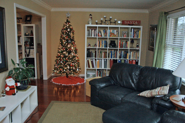
First, I picked out a bunch of light gray swatches, because even though *I* love the idea of turquois-y walls, I was pretty sure Ben wouldn't...and those red floors might not do so well anyhow with such a bright and dominant color. We agreed on a swatch that seemed to contrast enough with the white trim, but wasn't too dark or tinted any strange color.
Then I came up with this:
A PLAN:
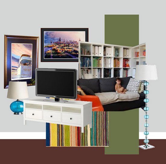
Working with the navy couch, white bookshelves & trim, green curtains and reddish floors, I added gray walls (using the color from my swatch) and some turquoise accents to make this color scheme.

Then I played around with some of the actual elements in the room, including two large paintings we have and put this idea board together (no, that's not my child in the photo...just someone who has the same Expedit shelves & a navy couch - convenient, eh?!):
Then I painted. It only took a day. Then I put everything back into place so we could decide if we like it or not:
AFTER:
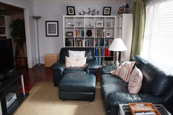
Why do the walls look baby blue? I don't know. Because things on your computer screen never turn out quite the same in real life. Actually, even in this photo they look more gray than they seem to look in real life. *sigh*
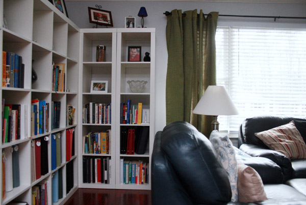
MY VIEW: (from my office chair)
I do REALLY love the Expedit shelves put together on a corner like this. Like a little mini-library that fills this side of the room quite well.
My general feelings so far about this new paint color:
- I like it better than the brown with the red floors.
- I'm not sure about the green. I might want a large gray fluffy rug instead and maybe some charcoal gray curtains.
- I'd like to replace the lampshade with a circular drum shade.
- I need a cool piece of furniture to put our TV on - painted white, or dark gray, I think.
- I need some turquoise accents!
- Should I have gone with a darker shade that looks less blue?
- I think the color should extend into my office, the entryway and upstairs hallway. But I don't think this particular color would work in the kitchen/playroom area of the house.
-
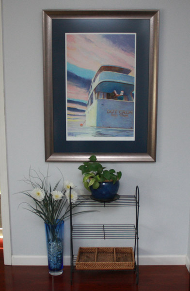
I like how it looks with our "Dot Calm" painting:
I'm open to suggestions and feedback! What do you think?












17 comments so far:
MyMove said:
Oh, wow! Dramatic change for the better! I really liked the thought process that you put in before you came to your decisions. Here's a useful iPhone painting app that you can try the next time you want to paint the walls of your house to help you in the color-picking process.
Trish D said:
Just another thought about the turquoise... If you really want to add it in to the color scheme, how about painting the wall just behind the bookcase, so it only shows up in the back of the shelves? You could use turquoise cardstock across the back for a couple of days to see if you like it first. If you do that, you might want to add another pop of turquoise to the couch or on your table closest to the camera. ☺
Trish D said:
Hi Andrea. I think the new color looks great with the navy furniture and floor color. The first thing that I noticed however, is that everything in your room is very linear. My eye was immediately drawn to the vase on your bookcase because of the shape. When you switch from a warm color to a cool color, it is important to add some 'movement' to the room so it retains that welcoming feel.
I would start by suggesting round pillows on your couch (or round rug if you're updating). I love the lamps that you picked out on your idea board but have to agree that adding another color might overwhelm the room.
With the visual weight of the furniture plus the bookcases, you might want to see if you can find lamps with a similar shape but with either frosted or pearlized glass instead. Again, a bell shaped shade would help to break up the vertical/horizontal lines of the room.
Please don't think I am picking it apart-- it does look really good. Just a few little touches to soften the edges and it will be perfect.
P.S. I am envious of all your beautiful, natural light ☺
Heather said:
Hi i’m Heather! I have a question for you! Please email me :)
HeatherVonSJ[at]gmail[dot]com
Laurie said:
I love it! I'm really liking the bookcases. I have a corner in my living room where I'd like to incorporate some bookcases. Now if I can just talk the hubs into it. :) I'm visiting you via Coastal Charm's Nifty Thrifty Tuesday and started following you.
http://www.laurieslittlebitsofcreativity.com/
Janet @ Cul-de-Sac Chic said:
I like it better now. I love blues over tans. I painted my main living areas blue after testing a dozen samples. When it was all said and done I hated it. It was probably too large an area for that color so I repainted it an greige. I do like it so much better in your case.
Blue is hard to photograph also. I like the expedit shelves set up across the corner. If you can add molding to them they would look built more built in.
momto8blog said:
love the color! I think it looks great! Makes me want to paint now!!
I am your newest follower..pls follow back if you can.
Erica said:
I love the shade of the walls.
I would replace the green curtains with maybe a darker gray to get that dark you desire. Add some pillows for a pop of turquoise or even a turquoise rug. Maybe paint the rug??!! In a chevron pattern like from this blog: http://www.thehouseofsmiths.com/2011/04/chevron-painted-rug-from-ikea.html
this looks like FUN stuff ;) Good luck!
joshsteed said:
Oh, I love the walls! I think it looks great with the navy. You may be right about the green curtains though:) I think a rug with a pattern would look really good with all the solids. You are doing a great job as always:):)
Rachel
the cape on the corner said:
i love the new color on the walls and that little library corner. great job recreating your moodboard! if you're sticking with the green curtains, i'd definitely bring that color in with pillow covers or something, and i like what the others said about pattern.
Anonymous said:
Love the colors! It really is beautiful, the bookshelves are my favorite.
Anonymous said:
I like your new look. The gray makes the room much brighter. The green curtains work with the rug nicely. Curtains and rugs are fairly expensive to replace so for now I like to suggest some ideas to make the room look pulled together for very little additional cost. It involves just making the green look purposeful in the room.
I've found that when at least three elements of a room are the same secondary color,the secondary color becomes an "accent" rather than an afterthought.
Green pillows with a several pops of color on the book cases and something green on the tv wall like green wicker baskets or boxes on the new white tv stand. A quickie fix for the tv wall for now be to add a fabric runner on top of the tv stand in a fabric matching the curtains and the pillows. Another fix using what you have would be to paint the top of the current tv stand a matching green. The pops of color on the book case could be covering the photo albums on the two bottom shelves with green book covers (something temporary, like kids use at school, in fabric or even thick paper - spray paint if you had to). You already have one green album on the shelf which looks pretty good. That is my inspiration for this last suggestion.
Janet Sanders said:
I think the gray looks nice with your navy - I've been looking at fabrics and thought of this when I saw your room - Might be wild but you have your navy and the teal and some pattern. Check out the whole Lark line.
http://www.fabric.com/ProductDetail.aspx?ProductID=26f7c561-17e7-4656-b1...
these are really pretty pillow covers too - not the cheapest. awesome fabrics though. I haven't found her source....
http://www.etsy.com/shop/ElemenOPillows?page=6
You could bring in a pattern in the curtians but a gray geometric would be nice too. The green works too.
If you have a Tuesday morning or Home Goods(love!) watch for lamps and pillows there.
Great start!
Dedra Sledd said:
I'm with Patricia, accent walls are usually a great way to add contrast, and I love transitional colors. I think it looks better than the tan walls too. I'd say you need some texture and pattern in the room. Everything is a solid color. I'd find some sort of patterned fabric that incorporates your color scheme and get some new window treatments and coordinating or matching pillows. As far as turquoise goes, I don't think I would pull in another color. Decorating is one of my favorite things to do! Have fun.
Mary Alice said:
On my computer it looks so fresh, clean, and crisp. Love what you did with the bookshelves.
Colors can be so hard to choose.
Your newest follower, Mary Alice
Prlinehan said:
Ok, another comment... you could have a tv stand finished in the same worn way as your refinished secretary ONLY you could do white/gray or turquoise/white or light gray/dark grey. Ooooh the options. Fun stuff! :)
Prlinehan said:
I like it! You could always do one of the walls in the same gray just a couple of shades darker if you want to add more contrast without painting the whole room all over again. You could do a "transitional color" in your office that would kind of serve as a bridge between the LR and Kitchen. ?
Post new comment