Kitchen/Dining Room - Before & After
So...since there never seems to be a true and official "DONE" to this decorating thing (even though I wish there were), I'll go ahead and share the kitchen and dining room after our painting marathon last week (1 week + 7 rooms + 7 ceilings, + 2 sick kids = pure chaos).
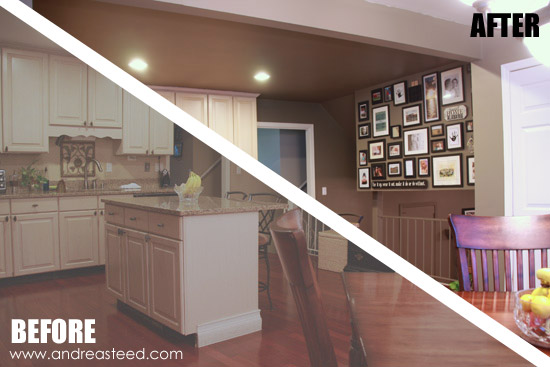
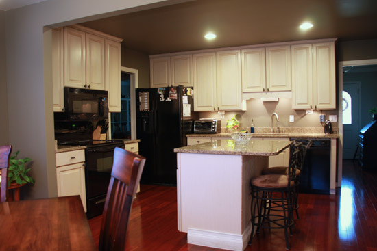
We went from a dirty, scratched, banged up and beaten khaki flat paint (that looks unbelievably better in photos than it did in person) to a rich, dark gray in the kitchen and dining room (that, ironically *doesn't* seem to photograph as well, but we love in person).
Besides the dirt and scuffs we were anxious to cover up, we weren't digging the brown on brown on more brown color scheme and have never liked how the khaki walls meshed with the reddish floors.
BEFORE:
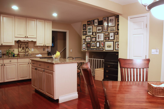
So, with the help of a professional decorating friend, we chose a dark gray paint - Sherwin Williams Anonymous 7046 - that we pulled from the flecks in our granite countertops. Since we started with almost NO contrast, we were looking for a very distinctly different color than the cabinets and counters.
AFTER:

In natural daylight, the color has a nice dark gray tone, but in more tungsten lighting at night, it does have a slight olive-greenish hue that I'm not *crazy* about...but it works, and replacing some light bulbs for whiter lighting might help with that.
Is the room darker? Yes. Cleaner? MUCH. And most importantly -- it's not so dang brown! It has a little bit of a restaurant/cafe feeling to it now.
AFTER:
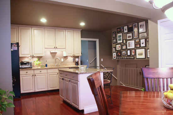
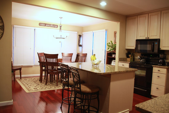
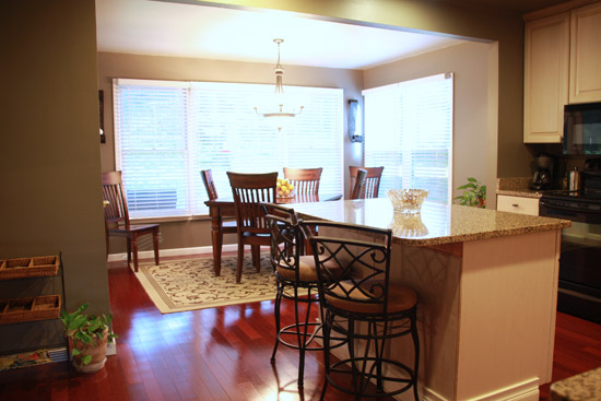
Here are some photos from all four corners of the room...
BEFORE:
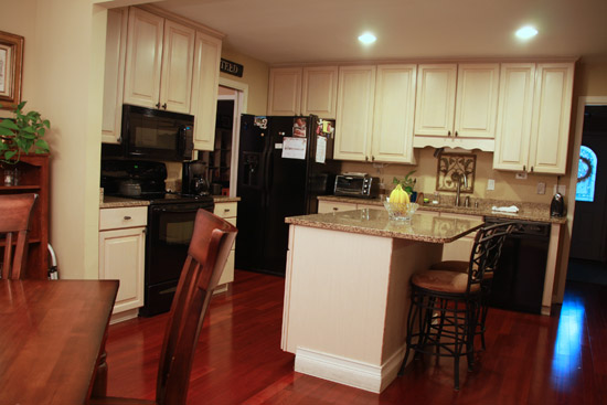
AFTER:
I'd still like to figure out how and where to add a pop of color without adding much clutter, (I'm open to suggestions - Throw rugs? Curtains on the porch doors? Backsplash art?) but for now, just being clean and painted is reward enough!
BEFORE:
Per our friend's professional suggestions, we also painted the ceilings the same color as the walls. We had intended to paint both the kitchen and dining room ceilings that same dark gray color, which we love in the kitchen (it actually makes the ceilings appear to recede and get taller). But...after one coat on the dining room ceiling, we were not happy with the way our light fixture reflected light off of the dark color. It looked very green and just wasn't good. So instead, we painted the ceiling in the dining room (which is nicely divided from the kitchen, even though it's an open space), two shades lighter in the same color family - Sherwin Williams Worldly Gray 7043. Ahh. Much better. With all the windows in there, it actually makes you kind of feel like you step outside when you sit down at the dining room table.
AFTER:
BEFORE:
AFTER:
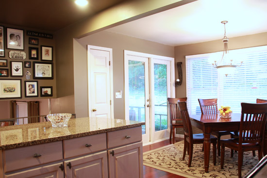
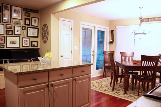
In addition to all the painting (and cleaning), we did a little bit of decluttering and moved some furniture out of the room to try and open it up even more. The tall brown bookshelf in the corner of the dining room has been replaced with a small round table and plant. And my black secretary desk that was underneath the gallery wall has been happily relocated to the entryway. Moving those larger pieces out gives us a little more breathing room and makes the rooms feel bigger.
I'm also trying to be *really* sure about the wall art and decor before I put more holes in the walls, and am trying hard not to fill EVERY. SINGLE. SPACE. That's very hard for me - it runs in my blood. Just ask my mom. :) So, I'm still pondering what to hang and whether to re-hang some of the wall art, which is why a few spots look oddly bare.
Wondering about how the gallery wall survived the repainting? No? I'm gonna tell you anyway.
I was pretty sure I wanted to keep it, and I KNEW I didn't want to have to rehang the whole thing from scratch, so when we prepped to paint the wall, I took everything down, but left the nails and marked the holes that I wanted filled with a red marker. Then I took all the nails out and we filled the unwanted holes (there were plenty of extras), but left the ones we needed. We painted right over it all, and when it came time to hang the gallery back up, I just followed a photograph of the old wall like a map to find the places where I could push the nails back into place and hang the photos. Worked wonderfully.
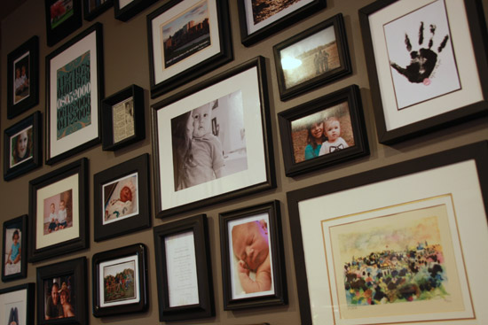
And whew...I think I still like it. :)
So there you have it. The kitchen/dining room not-so-big reveal, that no one on earth cares one bit about, except me. It's not plastic surgery...just a little makeup change. :)











23 comments so far:
MDM said:
Beautiful room. Really spacey and light and I love the dining table by the window. You've inspired me to do a picture wall like this I sure have enough frames! :)
Kim @ Too Much Time said:
Love it! I am so into gray paint lately and it really makes your cabinets pop. That gallery wall of yours is just stunning too!
Kim
Elise said:
Looks great!
Emily said:
I think it looks amazing! I live in a small apartment, so I just drool over posts like these. Well done!
Kelley said:
Hey Andrea! Thanks for linking up last week! Im featuring you tonight :D
BeColorful said:
Wow. Very impressive. Sounds like you had one helluva week. :D but the results sure made it well worth it I would say. Love this color. It is a bit darker than what I put in our kitchen but I think I may just like yours better. I think you are right that contrast really makes it all look so updated and clean. I luvs me a white kitchen and then add those "Anonymous" walls and in the words of Rachel Zoe, "I die". :D
Thanks for sharing on BeColorful this week.
p
Printabelle said:
The contrast really makes it! It looks fantastic! And you even did it with the sick kids, congrats!
Bonny said:
Very Pretty! Don't you love wood floors in the kitchen? We've had them in our past three houses, and so many people are afraid to do it, but I think they look so lovely and are easy enough to keep clean. I love your picture wall.
the cape on the corner said:
love the new wall color!
K Coake said:
Your new color looks really nice!
Feral Tirtle said:
Great makeover. You have a gorgeous kitchen. I bet it was a lot of work just to take your gallery wall apart and then to put it back again, and then all that painting! Good job!!
Wendy said:
The new paint colour looks amazing! Spend some time with it how it is before you do anything more - even I'm overwhelmed with all the suggestions people have given you about what else you could do! I, for one, am totally jealous of your kitchen; ours definitely needs a makeover! xx
Cristina said:
I love the color grey you picked! It looks really good with all the changes done!
Anita @ GoingalittleCoastal said:
I really like the change in colors. I think the new gray paint goes well with the floor and counters. I think a rug is a great way to add a pop of color and easy to change around. Maybe bring in some color from the dining room rug.
Jill said:
Lovely makeover! A change of colour makes all the difference!
Thanks for linking to a Round Tuit!
Hope you have a fabulous week!
Jill @ Creating my way to Success
http://www.jembellish.blogspot.com/
Cyndi @ The Decorating Chica said:
Great paint. It is amazing what a slight change in color will do and I TOTALLY understand that if it's not quite right, it's not right at all!!
I would do something different to the back of the island. You could paint it black or you could make it really exciting and paint it a bold, bright pop of color and really make it a focal point. Also, could add beadboard and then paint it white which would keep it light but give it some texture and help it to stand out more.
I would change out the blinds on the dining room windows. Maybe some rattan blinds that would give some texture and warmth and probably make the grey look more grey since the blinds are usually brown tones.
This would keep it neutral but add contrast.
Backsplash. I would do something, at the very least, over the sink. If tile is too intimidating, try the 'tin like' kitchen backsplash tiles that Lowe's carry (made to look like tin tiles). See my picture here http://decoratingchica.blogspot.com/2011/12/learning-from-pastlooking-to.... Cheaper and easier would be to hang a couple small pictures, maybe a couple of decorative plates or wrought iron art that would fit in that space.
Lastly, you have lots of beautiful cupboard. Maybe take the set over your sink or over your microwave and either remove the doors, or replace the inset with glass, or chicken wire, or something like that (depending on the feel you are going for). If you remove them, I would paint the inside of the cupboard a splash of color (possibly to coordinate with your island), change the shelves out to glass shelves, and then feature some beautiful dishes.
Great job. Love love love your photo gallery!
Hani Shabbir said:
I love, love and love your space, the gallery wall makes it look so special and wanting.. :) Thanks for linking up at the Friday Fun Party. Have a nice weekend!
Dream Mom said:
I think you are on your way. The gray paint color is nice but there are a few things you could do to make the room "sing".
-Paint the kitchen island black. Currently, the two rooms look a little disjointed color wise.
-Paint the dining room table and chairs white. The color of the table and chair doesn't really match anything in the kitchen so it sticks out. Black would work too and match the bar stools but I think I'd like the white better.
-Add a backsplash-perhaps a gray/white and black tile.
-Add a wide roman shade (doesn't have to be functional, it's just for looks) to the dining room windows. Use the same fabric and cover the bar stools in the same fabric. This will make the two rooms look like they go together. You could choose a modern white fabric with some black and/or gray in it to pick up the wall color. (In the future, pick the fabric first and color match the paint color instead of trying to find fabric to match the paint color.)
-If you can, ditch the "traditional rug" in the dining room. It appears from the bold kitchen paint color and gallery wall that you have a more modern asthetic and the traditional rug doesn't guite go. You could do a black rug with some white lines in it to pull it together.
I think these few changes would make the room look better.
Mama Fry said:
Paint the picture frames or change the mattes. Add color with knobs the have crystals or stone. Those things would be easy without a "permanent" change. Add a valance over the windows and doors.
Just some ideas.
I like the color.
Nifty thrify mom said:
I think the color gray looks great in your kitchen. I painted my kitchen gray also and had the same problem with the tones being different. My kitchen is dark gray and at night it has a blue undertone to it.
Megan said:
What a great color! It really makes your cabinets pop. Megan
Anne said:
It looks fabulous! Don't you hate it when the photos don't show how wonderful it really looks?? I have that problem all the time - I blame my camera! lol
I would totally paint those barstools a funky colour and get a patterned fabric for the seats. Then use that fabric for teatowels or potholders or even wrap it around stretched canvas to create easy artwork.
Gorgeous kitchen!
Prlinehan said:
Love it. It makes your cabinetry and trim look a lot brighter. :)
Post new comment