My Office Before & After
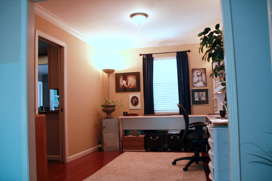
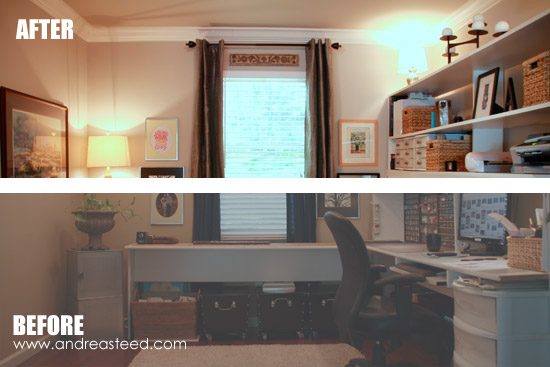 As part of our painting marathon a couple of weeks ago, my office got a new coat of paint - on both the walls and the ceiling.
While I would have loved some turquoise walls, I decided that it was probably better for our house as a whole to go with the same color we had chosen for the livingroom (which is attached to my office) and the rest of the house. - Sherwin Williams Worldly Gray 7043. We painted both the walls and ceiling the same color - and remarkably, only needed one coat of paint to cover it (we used the Sherwin Williams Cashmere paint and were very happy with it).
Along with covering over lots of scratches, dirt and a WHOLE bunch of holes in the walls, I took the opportunity to give my office a little sophistication upgrade as well.
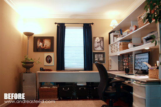
Before:
It used to be crafty and crowded (here's a before picture from a few years ago):
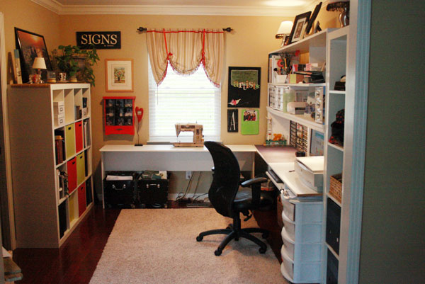
When I started feeling claustrophobic, I removed several things from the room, including that giant shelf on the left, that was relocated to Paxton's bedroom to store toys. But then my office was just kind of yellow-ish and boring as you can see here (photo taken a few weeks ago):
After:
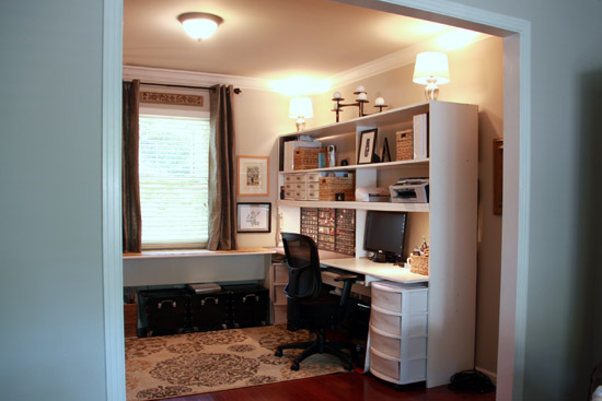
So here it is now, after a little more thought and attention to detail (probably too much if you ask Ben...I tend to get obsessive).
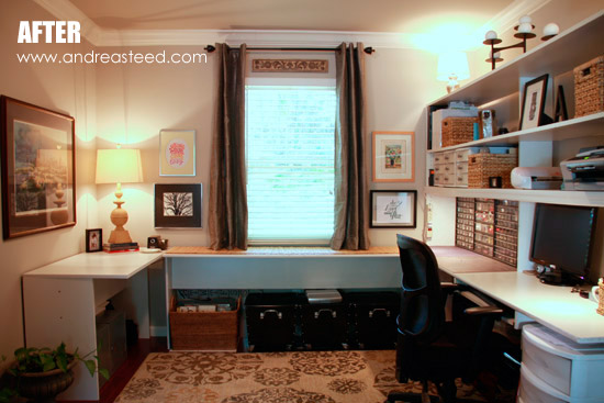
While there may still be a few tweaks to make along the way, I'm very happy with my slightly more sophisticated office. It flows much better now from the kitchen and livingroom on either side of it.
Subconsiously, I think I used this office as inspiration and stuck with very neutral shades of gray, tan, and brown, with a touch of color, found mostly in the artwork.
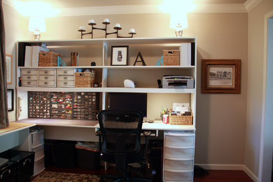
Here's a view from the living room (which is painted in the same color).
What's New?
I replaced the lampshades on lamps on top of my desk with round white shades instead of the old-style pleated shades that were on there before. I'm considering adding some trim or covering them with fabric to add some color...but haven't settled on that quite yet.
I also bought a new office chair (Temur-Pedic TP8000), which while it isn't exactly winning any style awards, is very comfortable, and that wins out when I sit in it ALL the time! My old chair was giving me all sorts of hip problems -- and I'm too young for that.
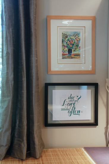
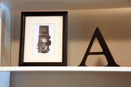
I really wanted the artwork in my office to be inspiring and meaningful -- and made by other artists...not by me. My old office was a little too self-indulgent I think, full of my own projects and artwork. It's time to appreciate the talent of others! Here's some info about some of the artwork I chose:
- A pen drawing of a statue and aquaduct called Fuente de las Tarascas that I bought in Morelia, Michoachan, Mexico the summer I studied there. (hanging to the right of my desk in the gold frame)
- A watercolor print "Flowers in Vase" from an Israeli artist called Victor Shrem (a wedding gift from my aunt & uncle)
- Do What You Love and Do it Often Printable from How Joyful (FREE)
- Vintage Camera Printable by Design Editor (FREE)
Left Corner:
Here's a look at the left corner of the office BEFORE:
And AFTER:
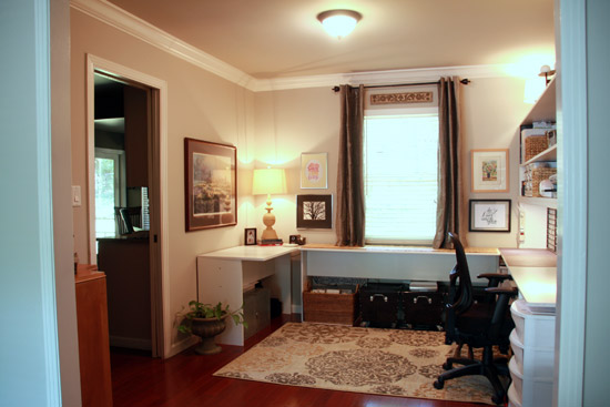
I bought, hung & hemmed (in that order) new curtains from World Market (Silver Dupioni Grommet Curtain). Don't look at the back of them. It ain't pretty. Seriously. But from the front...it'll do. A little tip - I hemmed these faux silk curtains by hand, while they were hanging on the pole. That way I knew they'd rest just above the top of my desk. Measuring isn't my strong suit and sewing faux silk was WAY too intimidating to attack with my sewing machine. I hung the curtains right below the crown molding instead of just above the window to help make the room look taller, and to match the height of the new curtains I bought for the living room.
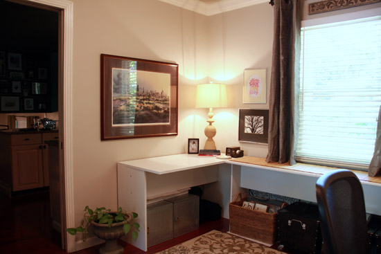
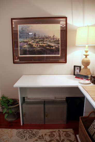
I built a third section to my desk to give myself some table space on the blank wall behind me. (Actually, I built about 75% of it. Ben finished it off after I messed it up and abandoned it to make dinner instead one night. He saves the day often on stuff like that - he's so much more precise than me!)
More Artwork Info:
- The large painting on the left is a watercolor print called "Autumn Sunset" of Chicago, painted by a family friend, Tom Lynch.
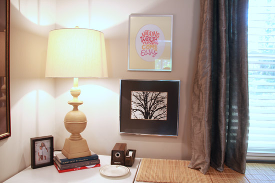
- "Nothing Worth Having Comes Easy" printed from internet - I can't find the original source... :(
- The black and white photograph of the bare tree was taken by my mom. I'm not sure where or when? I'll have to ask her. She had this frame & photo up in her old house on a gallery wall, and I inherited it when she downsized to a camper (she's a rambler now!)
I bought that new table lamp for the corner at Home Goods. I'm still thinking I might paint it a dark turquoise, but for now, I like the yellow.
The Rug:
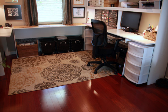
This rug took me FOREVER to decide on. I was pretty much obsessed with rug and curtain shopping both online and locally until I settled on this one from Target.com - Mohawk Medallion Rug. I had already bought and returned another rug, so I wasn't willing to order online unless I could easily return it locally. So I stuck with stores like Target. :) I like how it has a pattern, but isn't completely overwhelming and busy. Plus, the dark gray medallions tie in the couch from the livingroom (so do the curtains) and the light colored medallions bring out the gold in my storage baskets.
The "Hallway" Corner:
Finally, here's the last corner of the room, which may still need a little work. You can see how the room connects to both the livingroom (on the left) and kitchen on the right. It was originally supposed to be a formal dining room.
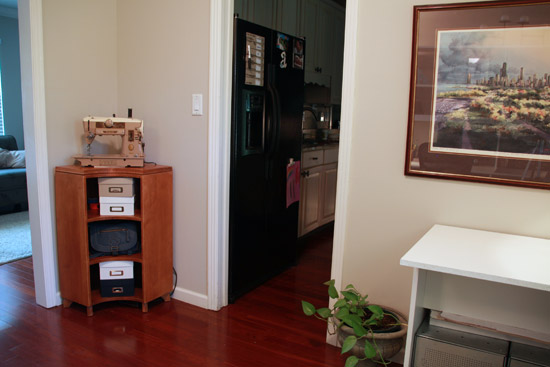
I'm thinking about painting this antique corner shelf, but can't decide on a color. Maybe a buttercream yellow? Or muted turqouise? I would leave it in the natural color, except I don't like how it looks next to the red hardwood floors. Maybe I could just paint the legs or the legs and the outside panels? I'm open to suggestions!
I'm not sure what (if anything) to put on the walls above it. Maybe some bare wall aren't so bad...
In any case, I'm calling the office "done" for now! And I love it. Maybe now I can get back to doing some work...instead of obsessively shopping for rugs and curtains.











28 comments so far:
Sarah @ Alderberry Hill said:
Thanks so much for linking to Make the Scene Monday, you are being featured later this evening!
Tauni said:
Wow. Great update. I need to finish off my room. Right now there are boxes all over the floor! Thanks for sharing a little inspiration on Show & Tell at SNAP! xoxo
Christy said:
I love the old way, and the new one. Ha. Great job! Thanks so much for linking up to tip-toe thru tuesday. I hope we see you this week!
Kathryn Griffin said:
What a great space to be creative! Thank you for sharing this at my Make it Pretty Monday party at The Dedicated House. Hope to see your prettiness again on Monday. Toodles, Kathryn @TheDedicatedHouse
andiejaye said:
i think that corner stand would be gorgeous in a muted, distressed turqoise.. maybe some accents of the same color in the desk area. it looks great! thanks so much for linking up to tip-toe thru tuesday.
Maryann @ Domestically Speaking said:
What a gorgeous work space you've created! I'm featuring it in the PoPP Spotlight this weekend. Thanks for linking up.
Kathy Gossen said:
And I thought the before looked good. LOL. Love that office! Kathy
Barb @ A Life in Balance said:
I love the makeover! My office needs some serious work. Ugh!
I would paint the corner shelves a light color, maybe a light turquoise. I'm not sure I would go with white; that might be too much since the rest of the furniture is white.
Holly Lefevre said:
What a gorgeous room! I will take a lot of inspiration from this!
vel said:
Great job!!! I love how organized it is now. :-)
Linking back from Carolyns Homework
Kathie said:
Wow! You have an amazing office! I love the rug and the u shaped workspace! Very productive without being cramped! Thanks for sharing at Gettin' Krafty!
simplesimonandco said:
LOVE the office!!!! Looks great!
Printabelle said:
Wow, it looks just fantastic! And I think you did a great job picking out the rug, it's a stunning one!
Jeannie Marie said:
More work space is better than more storage imho. You have created a room to love. Have a happy Rednesday this week!
Deborah said:
Your office is really beautiful! Mine would never look so organized without closed doors lol! I'm visiting from The Winthrop Chronicles. Have a great week!
Deborah
Dixie said:
You've utilized every inch! My home office reno has been on hold for about 2-years and now the plan is going in another direction! You've inspired me to declutter and utilitize my space wisely... now if I can just get my mojo going! Thanks for beautiful inspiration!
diy Design Fanatic said:
Your craft room looks great. It's come a long way and now it looks functional and stylish!
katherine said:
way awesome! Looks nice and organized, I saw you on Our Delightful home blog hop!
BeColorful said:
Lovin' it. In fact, you have me inspire to update my studio a bit. My needs have evolved and although I still want a colorful approach to my space I think it is now looking like a bit of whimsy overload. I like this more sophisticated vibe you have going on here. Thanks for sharing this on Motivated Monday this week.
p
PS I do wish you would consider turning off your verification. I often times have trouble reading these ambiguous letters and if I don't get it right the first time I move on. Just saying.
LO said:
What an amazing transformation - so much work! Nicely done - and i love that rug!
Jill said:
Lovely makeover of your office!
Thanks for linking to a Round Tuit!
Hope you have a fabulous week!
Jill @ Creating my way to Success
http://www.jembellish.blogspot.com/
Elise said:
Looks great!
Tania said:
It looks great, very soothing to the eye!
Tania
At the Picket Fence said:
What an awesome space Andrea! It looks beautiful and we are so glad you shared it with us this week at Inspiration Friday!
Vanessa
Michele @ Portlandia Vintage said:
Love what you have created. Well done!
Gail @ http://BibleLoveNotes.com said:
Looks great and more useful the way it's set up. And I like your little decorative touches. Great job.
Stuff and Nonsense said:
love this organized
and pretty space
what a great way
to utilize a room
that usually gets ignored
stopping by
from ATPF to say hello
and would love for you
to share this post
at Fridays Unfolded!
{alison}
Nokes2 said:
Really like it the colors & how it is organized.
Post new comment